

[This article was first published on Anything but R-bitrary, and kindly contributed to R-bloggers]. (You can report issue about the content on this page here)
Want to share your content on R-bloggers? click here if you have a blog, or here if you don't.
Want to share your content on R-bloggers? click here if you have a blog, or here if you don't.
This article was first published on analyze stuff. It has been contributed to Anything but R-bitrary as the second article in its introductory series.
By Max Ghenis
Today, we celebrate the would-be 85th birthday of Martin Luther King, Jr., a man remembered for pioneering the civil rights movement through his courage, moral leadership, and oratory prowess. This post focuses on his most famous speech, I Have a Dream [YouTube | text] given on the steps of the Lincoln Memorial to over 250,000 supporters of the March on Washington. While many have analyzed the cultural impact of the speech, few have approached it from a natural language processing perspective. I use R’s text analysis packages and other tools to reveal some of the trends in sentiment, flow (syllables, words, and sentences), and ultimately popularity (Google search volume) manifested in the rhetorical masterpiece.
Today, we celebrate the would-be 85th birthday of Martin Luther King, Jr., a man remembered for pioneering the civil rights movement through his courage, moral leadership, and oratory prowess. This post focuses on his most famous speech, I Have a Dream [YouTube | text] given on the steps of the Lincoln Memorial to over 250,000 supporters of the March on Washington. While many have analyzed the cultural impact of the speech, few have approached it from a natural language processing perspective. I use R’s text analysis packages and other tools to reveal some of the trends in sentiment, flow (syllables, words, and sentences), and ultimately popularity (Google search volume) manifested in the rhetorical masterpiece.
Bag-of-words
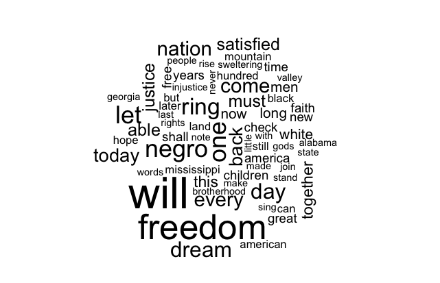
Word clouds are somewhat controversial among data scientists: some see them as overused and cliche, while others find them a useful exploratory tool, particularly for connecting with a less analytical audience. I consider them a fun and useful starting point, so I started off by throwing the speech’s text into Wordle.


R also has a wordcloud package, though it’s hard to beat Wordle on looks.
# Load raw data, stored at textuploader.com
speech.raw <- paste(scan(url("http://textuploader.com/1k0g/raw"),
                         what="character"), collapse=" ")

library(wordcloud)
wordcloud(speech.raw) # Also takes other arguments like color

Calculating textual metrics
The qdap package provides functions for text analysis, which I use to split sentences, count syllables and words, and estimate sentiment and readability. I also use the data.table package to organize the sentence-level data structure.
< !--R code-->
library(qdap)
library(data.table)

# Split into sentences
# qdap's sentSplit is modeled after dialogue data, so person field is needed
speech.df <- data.table(speech=speech.raw, person="MLK")
sentences <- data.table(sentSplit(speech.df, "speech"))
# Add a sentence counter and remove unnecessary variables
sentences[, sentence.num := seq(nrow(sentences))]
sentences[, person := NULL]
sentences[, tot := NULL]
setcolorder(sentences, c("sentence.num", "speech"))

# Syllables per sentence
sentences[, syllables := syllable.sum(speech)]
# Add cumulative syllable count and percent complete as proxy for progression
sentences[, syllables.cumsum := cumsum(syllables)]
sentences[, pct.complete := syllables.cumsum / sum(sentences$syllables)]
sentences[, pct.complete.100 := pct.complete * 100]
qdap’s sentiment analysis is based on a sentence-level formula classifying each word as either positive, negative, neutral, negator or amplifier, per Hu & Liu’s sentiment lexicon. The function also provides a word count.
< !--R code for calculating sentiment and word count-->
pol.df <- polarity(sentences$speech)$all
sentences[, words := pol.df$wc]
sentences[, pol := pol.df$polarity]
A scatterplot hints that polarity increases throughout the speech; that is, the sentiment gets more positive.
< !--R code for basic polarity plot-->
with(sentences, plot(pct.complete, pol))

Cleaning up the plot and adding a LOESS smoother clarifies this trend, particularly the peak at the end.
< !--R code for enhanced polarity plot-->
library(ggplot2)
library(scales)

my.theme <-
  theme(plot.background = element_blank(), # Remove background
        panel.grid.major = element_blank(), # Remove gridlines
        panel.grid.minor = element_blank(), # Remove more gridlines
        panel.border = element_blank(), # Remove border
        panel.background = element_blank(), # Remove more background
        axis.ticks = element_blank(), # Remove axis ticks
        axis.text=element_text(size=14), # Enlarge axis text
        axis.title=element_text(size=16), # Enlarge axis title
        plot.title=element_text(size=24, hjust=0)) # Enlarge, left-align title

CustomScatterPlot <- function(gg)
  return(gg + geom_point(color="grey60") + # Lighten dots
           stat_smooth(color="royalblue", fill="lightgray", size=1.4) +
           xlab("Percent complete (by syllable count)") +
           scale_x_continuous(labels = percent) + my.theme)

CustomScatterPlot(ggplot(sentences, aes(pct.complete, pol)) +
                    ylab("Sentiment (sentence-level polarity)") +
                    ggtitle("Sentiment of I Have a Dream speech"))

Through the variation, the trendline reveals two troughs (calls to action, if you will) along with the increasing positivity.
Readability tests are typically based on syllables, words, and sentences in order to approximate the grade level required to comprehend a text. qdap offers several of the most popular formulas, of which I chose the Automated Readability Index.
Readability tests are typically based on syllables, words, and sentences in order to approximate the grade level required to comprehend a text. qdap offers several of the most popular formulas, of which I chose the Automated Readability Index.
< !--R code for readability-->
sentences[, readability := automated_readability_index(speech, sentence.num)
          $Automated_Readability_Index]
By graphing similarly to the above polarity chart, I show readability to be mostly constant throughout the speech, though it varies within each section. This makes sense, as one generally avoids too many simple or complex sentences in a row.
< !--R code for readability-->
CustomScatterPlot(ggplot(sentences, aes(pct.complete, readability)) +
                    ylab("Automated Readability Index") +
                    ggtitle("Readability of I Have a Dream speech"))

Scraping Google search hits
Google search results can serve as a useful indicator of public opinion, if you know what to look for. Last week I had the pleasure of meeting Seth Stephens-Davidowitz, a fellow analyst at Google who has used search data to research several topics, such as quantifying the effect of racism on the 2008 presidential election (Obama did worse in states with higher racist query volume). There’s a lot of room for exploring historically difficult topics with this data, so I thought I’d use it to identify the most memorable pieces of I Have a Dream.
Fortunately, I was able to build off of a function from theBioBucket’s blog post to count Google hits for a query.
< !--R code for GoogleHits-->
GoogleHits <- function(query){
  require(XML)
  require(RCurl)

  url <- paste0("https://www.google.com/search?q=", gsub(" ", "+", query))

  CAINFO = paste0(system.file(package="RCurl"), "/CurlSSL/ca-bundle.crt")
  script <- getURL(url, followlocation=T, cainfo=CAINFO)
  doc <- htmlParse(script)
  res <- xpathSApply(doc, '//*/div[@id="resultStats"]', xmlValue)
  return(as.numeric(gsub("[^0-9]", "", res)))
}
From there I needed to pass each sentence to the function, stripped of punctuation and grouped in brackets, and with “mlk” added to ensure it related to the speech.
< !--R code to determine Google hits for each sentence-->
sentences[, google.hits := GoogleHits(paste0("[", gsub("[,;!.]", "", speech),
                                             "] mlk"))]


