

Want to share your content on R-bloggers? click here if you have a blog, or here if you don't.


A vital part of statistics is producing nice plots, an area where R is outstanding. The graphical ablility of R is often listed as a major reason for choosing the language. It is therefore funny that exporting these plots is such an issue in Windows. This post is all about how to export anti-aliased, high resolution plots from R in Windows.
There are two main problems when exporting graphics from R:
- Anti-aliasing is not activated in Windows R (this does not apply to Linux or Mac)
- When increasing the resolution the labels automatically decrease and become unreadable
My previous solution to this problem has been to export my graph to a vector graphic (usually the SVG format), open it in Inkscape, and then export it to the resolution of choice. The vector graphics allows smooth scaling without me having to worry about the text becoming too small to read while at the same time adding the anti-aliasing. The down-side of this is that it is not really a convenient work-flow when you create knitr/Sweave documents where many plots are simultaneously generated.
Exporting
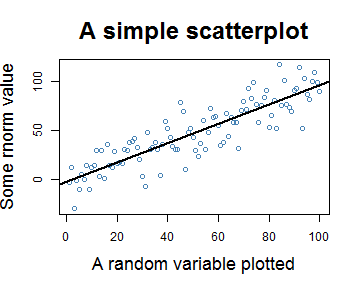
Let us start by looking at an exported plot from RStudio, clearly not something I would like to send to a journal:

So the first alternative would be the standard library. We can kick-off with the svg() function as I mentioned it earlier (Note: If you can’t see the plot then your browser is probably old and does not support svg images):
1 2 3 4 5 6 | svg(filename="Std_SVG.svg",
width=5,
height=4,
pointsize=12)
my_sc_plot(data)
dev.off() |

All images in this post use the same basic settings with minor tweaks:
- Width = 5 inches
- Height = 4 inches
- pointsize = 12
If we now do the same using the png() command we also have to set the resolution. I’m using 72 dpi (pixels/inch), as 1 point by the modern definition is 1/72 of the international inch and therefore a good start instead of the 96 dpi that Windows uses. As you can see the size of the labels are very similar to the svg():
1 2 3 4 5 6 7 8 | png(filename="Std_PNG.png",
units="in",
width=5,
height=4,
pointsize=12,
res=72)
my_sc_plot(data)
dev.off() |
Note: The Cairo packages are obsolete as it usually is built in nowadays, all you need to do is remember to reference it – see my update
The Cairo-package
The Cario package is an excellent choice for getting antia-aliased plots in Windows. Here’s the same plot from the Cairo package (the background is now transparent):
1 2 3 4 5 6 7 8 9 10 | library(Cairo)
Cairo(file="Cairo_PNG_72_dpi.png",
type="png",
units="in",
width=5,
height=4,
pointsize=12,
dpi=72)
my_sc_plot(data)
dev.off() |

If we want to increase the resolution of the plot we can’t just change the resolution parameter:
1 2 3 4 5 6 7 8 9 | Cairo(file="Cairo_PNG_96_dpi.png",
type="png",
units="in",
width=5,
height=4,
pointsize=12,
dpi=96)
my_sc_plot(data)
dev.off() |

We also have to change the point size, the formula is size * new resolution DPI / 72 DPI:
1 2 3 4 5 6 7 8 9 | Cairo(file="Cairo_PNG_96_dpi_adj.png",
type="png",
units="in",
width=5,
height=4,
pointsize=12*92/72,
dpi=96)
my_sc_plot(data)
dev.off() |

If we double the image size we also need to double the point size:
1 2 3 4 5 6 7 8 9 | Cairo(file="Cairo_PNG_72_dpi_x_2.png",
type="png",
units="in",
width=5*2,
height=4*2,
pointsize=12*2,
dpi=72)
my_sc_plot(data)
dev.off() |

The cairoDevice package
An alternative to the Cairo package is the cairoDevice package. It uses the same engine but has a slightly different syntax and due to it’s limitation in setting the resolution it really doesn’t work that well. Lets try the same as above:
1 2 3 4 5 6 7 8 9 10 11 | # Detach the Cairo package just to make
# sure that there aren't any conflicts
detach("package:Cairo")
library(cairoDevice)
Cairo(filename="cairoDevice_SVG_pt12.svg",
surface="png",
width=5,
height=4,
pointsize=12)
my_sc_plot(data)
dev.off() |

To be fair the default point size of the cairoDevice package, 8 points is less than for the Cairo package but even with that setting the image looks not that great:

After some tweaking I found that 5.2 points was fairly similar:

Summary
The Cairo package does the job nicely and without too much hassle you can get the look exactly right. If you want the background to be white just add the bg parameter:
1 2 3 4 5 6 7 8 9 10 | Cairo(file="Cairo_PNG_72_dpi_white.png",
bg="white",
type="png",
units="in",
width=5,
height=4,
pointsize=12,
dpi=72)
my_sc_plot(data)
dev.off() |

Update
After Matt Neilsons excellent comment I’ve discovered that the standard export functions actually allow for anti-aliasing with built-in cairo support. Another excellent part is that the dpi now works exactly as expected – you don’t need to adjust the point size ![]()

1 2 3 4 5 6 7 8 9 | png(filename="Std_PNG_cairo.png",
type="cairo",
units="in",
width=5,
height=4,
pointsize=12,
res=96)
my_sc_plot(data)
dev.off() |

Here’s the plot code:
1 2 3 4 5 6 7 8 9 10 11 12 13 14 15 | # Create the data
data <- rnorm(100, sd=15)+1:100
# Create a simple scatterplot
# with long labels to enhance
# size comparison
my_sc_plot <- function(data){
par(cex.lab=1.5, cex.main=2)
plot(data,
main="A simple scatterplot",
xlab="A random variable plotted",
ylab="Some rnorm value",
col="steelblue")
x <- 1:100
abline(lm(data~x), lwd=2)
} |
R-bloggers.com offers daily e-mail updates about R news and tutorials about learning R and many other topics. Click here if you're looking to post or find an R/data-science job.
Want to share your content on R-bloggers? click here if you have a blog, or here if you don't.