
Visualization of Tumor Response – Spider Plots
Want to share your content on R-bloggers? click here if you have a blog, or here if you don't.
A collection of some commonly used and some newly developed methods for the visualization of outcomes in oncology studies include Kaplan-Meier curves, forest plots, funnel plots, violin plots, waterfall plots, spider plots, swimmer plot, heatmaps, circos plots, transit map diagrams and network analysis diagrams (reviewed here). Previous articles in this blog presented an introduction to forest plots, violin plots and waterfall plots as well as provided some R code for the generation of these plots. As a continuation of the series, the current article provides an introduction to spider plots for the visualization of tumor response and generation of the same using R.
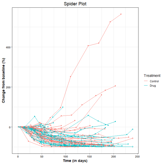
Spider plots in oncology are used to depict changes in tumor measurements over time, relative to the baseline measurement. The resulting graph looks like the legs of a spider and hence the name. Additional information can be incorporated into the plot by varying the color and shape of points as well as the color and style of the lines. Here is a post on the creation of spider plots using SAS.
In domains other than medical/oncology, radar charts are sometimes also called spider plots. To clarify to readers, this post is not about the generation of radar charts.
To illustrate the generation of spider plot in R, we use as example data, the sample dataset provided along with the tumgr R package. This dataset is a sample of control arm data from a phase 3, randomized, open-label study evaluating DN-101 in combination with Docetaxel in androgen-independent prostate cancer (AIPC) (ASCENT-2). However, to illustrate the incorporation of treatment information into the plot, the subjects in this dataset were randomly placed into control and drug treatment arms. Also, the follow-up time was restricted to 240 days (8 months).
The spider plot is generated with R version 3.5.0 using package ggplot2 (version 3.0.0).
library(tumgr) ## For the example dataset
library(ggplot2)

set.seed(1234)
tumorgrowth <- sampleData
tumorgrowth <- do.call(rbind,
by(tumorgrowth, tumorgrowth$name,
     function(subset) within(subset,
              { treatment <- ifelse(rbinom(1,1,0.5), "Drug","Control")   ## subjects are randomly placed in control or drug treatment arms
                o <- order(date)
                date <- date[o]
                size <- size[o]
                baseline <- size[1]
                percentChange <- 100*(size-baseline)/baseline
                time <- ifelse(date > 240, 240, date) ## data censored at 240 days
                cstatus <- factor(ifelse(date > 240, 0, 1))
              })))
rownames(tumorgrowth) <- NULL

## Save plot in file
png(filename = "C:\\Path\\To\\SpiderPlot\\SpiderPlot.png", width = 640, height = 640)

## Plot settings
p <- ggplot(tumorgrowth, aes(x=time, y=percentChange, group=name)) +
      theme_bw(base_size=14) +
      theme(axis.title.x = element_text(face="bold"), axis.text.x = element_text(face="bold")) +
      theme(axis.title.y = element_text(face="bold"), axis.text.y = element_text(face="bold")) +
      theme(plot.title = element_text(size=18, hjust=0.5)) +
      labs(list(title = "Spider Plot", x = "Time (in days)", y = "Change from baseline (%)"))
## Now plot
p <- p + geom_line(aes(color=treatment)) +
      geom_point(aes(shape=cstatus, color=treatment), show.legend=FALSE) +
      scale_colour_discrete(name="Treatment", labels=c("Control", "Drug")) +
      scale_shape_manual(name = "cstatus", values = c("0"=3, "1"=16)) +
      coord_cartesian(xlim=c(0, 240))
print(p)
dev.off()
Here is the resulting spider plot. The + symbols represent censored observations.
R-bloggers.com offers daily e-mail updates about R news and tutorials about learning R and many other topics. Click here if you're looking to post or find an R/data-science job.
Want to share your content on R-bloggers? click here if you have a blog, or here if you don't.