
San Francisco Crime Data Analysis Part 2
Want to share your content on R-bloggers? click here if you have a blog, or here if you don't.
Hello ladies and gents! After, a long break due to my PhD dissertation taking all my time, I am finally back.
I am done with my PhD studies, and got my degree. Yaay for me
Let’s continue our analysis of SF crime data. In the first part I had analyzed
the data among different variables, and checked quite a lot heat map plots. However, the data also has the latitude and
longitude data and an analysis on crime would never be complete without maps, right? Let’s do that!
library(data.table)
library(ggplot2)
library(lubridate)
library(plotly)
library(dplyr)

setwd("/San Francisco Crime")
trn = fread('train.csv')

##
Read 878049 rows and 9 (of 9) columns from 0.119 GB file in 00:00:03


trn[, DayOfWeek:=factor(DayOfWeek, ordered=TRUE, levels=c("Monday", "Tuesday", "Wednesday", "Thursday", "Friday", "Saturday", "Sunday"))]
Before staring the mapping process, I realized an interesting fact from
the previous section. Remember that Tenderloin was the safest place at
weekends, and not so in mid-week. Well, from the above two plots we can
see that Tenderloin is the place where drugs is the most prevalent
crime. So, let’s check the weekday – place relation for only the drug
crime.
d = trn[i = Category == 'DRUG/NARCOTIC',j = .N, by = .(DayOfWeek, PdDistrict)]
g = ggplot(d, aes(y = PdDistrict, x = DayOfWeek)) +
    geom_point(aes(size = N, col = N)) +
    scale_size(range=c(1,10)) +
    theme(axis.title.x = element_blank(),
          axis.title.y = element_blank())
ggplotly(g, tooltip = c('x','y','colour'))

trn[, .N, by = Category][order(N, decreasing = T)][1:10]

##           Category      N
##  1:  LARCENY/THEFT 174900
##  2: OTHER OFFENSES 126182
##  3:   NON-CRIMINAL  92304
##  4:        ASSAULT  76876
##  5:  DRUG/NARCOTIC  53971
##  6:  VEHICLE THEFT  53781
##  7:      VANDALISM  44725
##  8:       WARRANTS  42214
##  9:       BURGLARY  36755
## 10: SUSPICIOUS OCC  31414
As can be seen the drug traffic increases midweek in Tenderloin, and
since drug crime holds quite a significant place in the overall crime
distribution, this also increases the crime rate of Tenderloin among all
districts.
OK, with that out of the way we can start mapping. We will import the
ggmap library.
library(ggmap)

# sf = get_map(location = "san francisco", maptype = "terrain", source = "google", zoom = 12)
# map = ggmap(sf)

# geocode(location = '37.746330, -122.449067') %>%
#     get_map(maptype = "terrain", source = "google", zoom = 12) %>%
#     ggmap()

# sf = get_openstreetmap(bbox = c(left = -122.5164, bottom = 37.7066, right = -122.3554, top = 37.8103), scale = 68247) # scale = 68247 == zoom level 13

sf = get_stamenmap(bbox = c(left = -122.5164, bottom = 37.7066, right = -122.3554, top = 37.8103), maptype = c("toner-lite"), zoom = 13)
 # maptype = c("terrain", "terrain-background",
 #  "terrain-labels", "terrain-lines", "toner", "toner-2010", "toner-2011",
 #  "toner-background", "toner-hybrid", "toner-labels", "toner-lines",
 #  "toner-lite", "watercolor")

map = ggmap(sf)
map
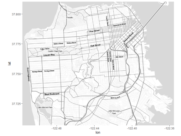
I have commented out some other possiblites for creating the map. I
decided to go with stamenmap as I found it to be the best to display
data. After importing ggmap, and getting the bounding box values of San
Francisco from openstreetmap.org, the map is created. Let’s plot some
data onto the map. First, 500 random data points are plotted. We can see
that there is a higher density in the downtown area, specifically
Tenderloin Police District. This is made more obviuous in the second
plot where total number of crimes at each area is proportional to its
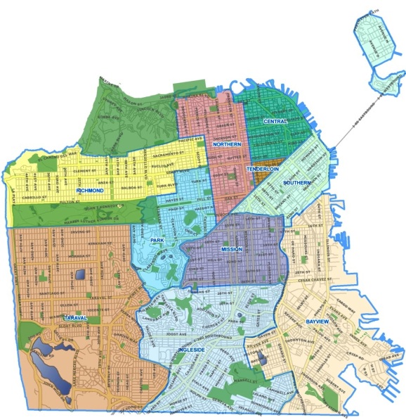
size and color. Also, before starting the analysis I have provided the district
map of SF.
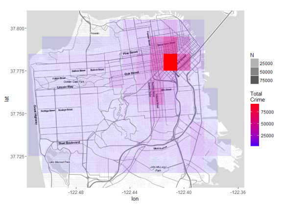
map + geom_point(data = sample_n(trn, 500), aes(x = X, y = Y))

BinnedCounts = trn[, .(.N), by = .(Long = round(X,2), Lat = round(Y,2))][order(N, decreasing = T)]
str(BinnedCounts)

## Classes 'data.table' and 'data.frame':   139 obs. of  3 variables:
##  $ Long: num  -122 -122 -122 -122 -122 ...
##  $ Lat : num  37.8 37.8 37.8 37.8 37.8 ...
##  $ N   : int  94754 50299 44314 40365 34843 34632 25963 24112 19586 17213 ...
##  - attr(*, ".internal.selfref")=


map +
    geom_point(data = BinnedCounts, aes(x = Long, y = Lat, color = N, size=N)) +
    scale_colour_gradient(name = '# Total Crime', low="blue", high="red") +
    scale_size(name = '# Total Crime', range = c(2,15))

Using the color and size of the points we can plot the total crime onto
the map and easily determine the crime rich areas. There are also other
kind of plots which could be more useful with the purpose of showing the
crime density.
map +
stat_density2d( data = sample_frac(trn, 0.2), aes(x = X, y = Y, fill = ..level.., alpha = ..level..), size = 1, bins = 50, geom = 'polygon') +
scale_fill_gradient('Crime\nDensity', low = 'blue', high = 'orange') +
scale_alpha(range = c(.2, .3), guide = FALSE) +
guides(fill = guide_colorbar(barwidth = 1.5, barheight = 10))

map +
    stat_bin2d(data = trn, aes(x = X, y = Y, fill = ..density.., alpha = ..density..), bins = 30, size = 1) +
    scale_fill_gradient('Crime\nDensity', low = 'blue', high = 'orange')

The first is a map with the crime density contours which uses
‘stat_density2d’. The second one is a heatmap where each tile is a bin
of the aggregate value of what is being plotted, which uses
‘stat_bin2d’. In this case it is the total number of crime in that tile
– or area.
We can also create a binned plot manually. By doing this we can have
more options in plotting.
map +
    geom_tile(data = BinnedCounts, aes(x = Long, y = Lat, fill = N, alpha = N)) +
    scale_fill_gradient('Total\nCrime', low = 'blue', high = 'red')
Here the tiles are too large. The crime map will look better if the
tiles were smaller, just like before when we used ‘stat_bin2d’. Since
San Francisco looks like a square in both the horizontal and vertical
directions it can be divided into 30 equal pieces in both directions.
This will give 30*30=900 land tiles. Some of them will fall onto water
areas, so the actual number will be less.
# The following box coordinates are obtained from openstreetmap.org.
bbox = data.table(left = -122.5164, bottom = 37.7066, right = -122.3554, top = 37.8103)

x_length = abs(bbox[, left - right])/30
y_length = abs(bbox[, bottom - top])/30

trn[, LatBinned := round(Y/y_length)*y_length]
trn[, LongBinned := round(X/x_length)*x_length]
After binning the points into each one of the newly defined areas we can
plot the maps. These new rounded lat and long’s are post-fixed with the
word ‘Binned’.
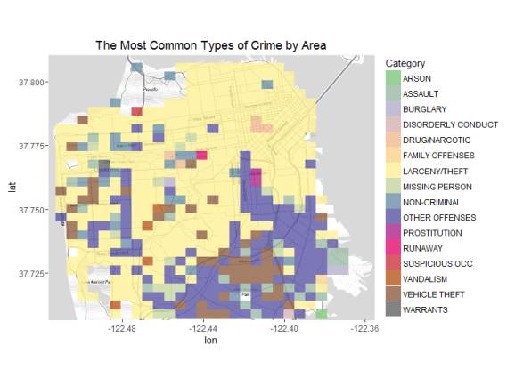
In the first we’ll plot the largest crime in each area. In the second,
the second largest crimes are shown.
f = trn[, .N, keyby = .(LatBinned, LongBinned, Category)][
    order(LatBinned, LongBinned, N, decreasing = T)]
f1 = f[j = Category[1] , by = .(LatBinned, LongBinned)]
f2 = f[j = Category[2] , by = .(LatBinned, LongBinned)]

setnames(f1, 'V1', 'Category'); setnames(f2, 'V1', 'Category')
library(RColorBrewer)
# display.brewer.all()

# map + geom_tile(data = f1, aes(x = LongBinned, y = LatBinned, fill = Category))
# map + geom_tile(data = f2, aes(x = LongBinned, y = LatBinned, fill = Category))

getPalette = colorRampPalette(brewer.pal(n = 8, name = "Accent"))

numDistinctColors = length(unique(f1$Category))
map +
    geom_tile(data = f1, aes(x = LongBinned, y = LatBinned, fill = Category), alpha = 0.8) +
    scale_fill_manual(values = getPalette(numDistinctColors)) +
    ggtitle('The Most Common Types of Crime by Area')
numDistinctColors = length(unique(f2$Category))
map +
    geom_tile(data = f2, aes(x = LongBinned, y = LatBinned, fill = Category), alpha = 0.8) +
    scale_fill_manual(values = getPalette(numDistinctColors)) +
    ggtitle('The 2nd Most Common Types of Crime by Area')
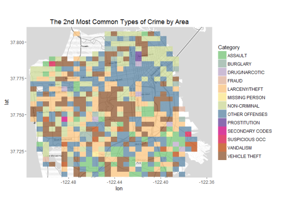
So the most common crime is larceny/ theft in SF. Towards the south
vehicle theft is also quite common. Now when the second most prevalent
crimes in the areas are checked, we see other, non criminal, and vehicle
theft being quite common. So let’s take larceny, other and noncriminal
offenses out and recheck our map.
f = trn[i = !Category %in% c('LARCENY/THEFT', 'OTHER OFFENSES', 'NON-CRIMINAL'), .N, keyby = .(LatBinned, LongBinned, Category)][
    order(LatBinned, LongBinned, N, decreasing = T)]
f1 = f[j = Category[1] , by = .(LatBinned, LongBinned)]
f2 = f[j = Category[2] , by = .(LatBinned, LongBinned)]

setnames(f1, 'V1', 'Category'); setnames(f2, 'V1', 'Category')

getPalette = colorRampPalette(brewer.pal(n = 8, name = "Accent"))

numDistinctColors = length(unique(f1$Category))
map +
    geom_tile(data = f1, aes(x = LongBinned, y = LatBinned, fill = Category), alpha = 0.8) +
    scale_fill_manual(values = getPalette(numDistinctColors)) +
    ggtitle('The Most Common Types of Crime by Area')
numDistinctColors = length(unique(f2$Category))
map +
    geom_tile(data = f2, aes(x = LongBinned, y = LatBinned, fill = Category), alpha = 0.8) +
    scale_fill_manual(values = getPalette(numDistinctColors)) +
    ggtitle('The 2nd Most Common Types of Crime by Area')
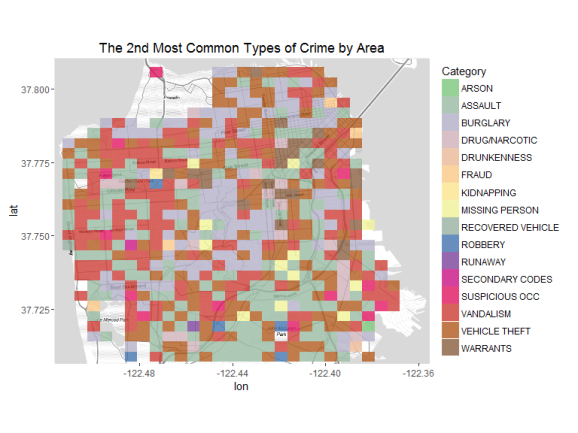
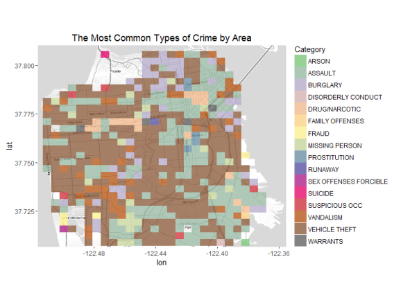
Now the winner is vehicle theft all around SF. Assault seems to be a
common crime as well. The second most common crimes in SF are burglary,
vandalism, vehicle theft, and assault.
Previously we had found that drug crime was most prevalent in
Tenderloin. Let’s plot each district’s most problematic and the second
most prevalent crime type on the map.
f = trn[, .N, by = .(PdDistrict, Category)][order(-PdDistrict, N, decreasing = T)]
location = trn[, j = .(Lat = mean(X), Long = mean(Y)), by = .(PdDistrict)]

f1 = f[j = .(Category[1], N[1]) , by = .(PdDistrict)]
setnames(f1, old = c('V1', 'V2'), new = c('Category', 'N'))
f1 = merge(f1, location, by = 'PdDistrict')

map +
    geom_point(data = f1, aes(x = Lat, y = Long, size = N, color = Category)) +
    scale_size(name = '# Total Crime', range = c(3,12)) +
    ggtitle('Most Common Crime Types')

f2 = f[j = .(Category[2], N[2]) , by = .(PdDistrict)]
setnames(f2, old = c('V1', 'V2'), new = c('Category', 'N'))
f2 = merge(f2, location, by = 'PdDistrict')

map +
    geom_point(data = f2, aes(x = Lat, y = Long, size = N, color = Category)) +
    scale_size(name = '# Total Crime', range = c(3,12)) +
    ggtitle('Second Most Common Crime Types')

Finally, let’s analzye the drug crime only by plotting it on the map for
Wednesday and Saturday.
f = trn[i = Category %in% c('DRUG/NARCOTIC'), .N, keyby = .(DayOfWeek, LatBinned, LongBinned)][
    order(LatBinned, LongBinned, N, decreasing = T)]

f1 = f[i = DayOfWeek == 'Wednesday']
f2 = f[i = DayOfWeek == 'Saturday']

map +
    geom_tile(data = f1, aes(x = LongBinned, y = LatBinned, alpha = N), fill = 'red') +
    ggtitle('Drug Crime Wednesday')

map +
    geom_tile(data = f2, aes(x = LongBinned, y = LatBinned, alpha = N), fill = 'red') +
    ggtitle('Drug Crime Saturday')
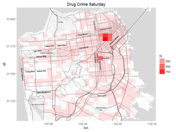
So we can see that Tenderloin is the winner on both days, but the number
of crimes reagrding drugs decreases by half on Saturday compared to
Wednesday.
In this post I have further analyzed the San Francisco Crime Data by
using maps. Hope you enjoyed it. Bye!
Ilyas Ustun


R-bloggers.com offers daily e-mail updates about R news and tutorials about learning R and many other topics. Click here if you're looking to post or find an R/data-science job.
Want to share your content on R-bloggers? click here if you have a blog, or here if you don't.