
Reshaping Horse Import/Export Data to Fit a Sankey Diagram
Want to share your content on R-bloggers? click here if you have a blog, or here if you don't.
As the food labeling and substituted horsemeat saga rolls on, I’ve been surprised at how little use has been made of “data” to put the structure of the food chain into some sort of context* (or maybe I’ve just missed those stories?). One place that can almost always be guaranteed to post a few related datasets is the Guardian Datastore, who use EU horse import/export data to produce interactive map of the European trade in horsemeat
*One for the to do list – a round up of “#ddj” stories around the episode.)

(The article describes the source of the data as the Eurpoean Union Unistat statistics website, although I couldn’t find a way of recreating the Guardian spreadsheet from that source. When I asked Simon Rogers how he’d come by the data, he suggested putting questions into the Eurostat press office;-)
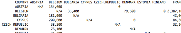
The data published by the Guardian datastore is a matrix showing the number of horse imports/exports between EU member countries (as well as major traders outside the EU) in 2012:

One way of viewing this data structure is as an edge weighted adjacency matrix that describes a graph (a network) in which the member countries are nodes and the cells in the matrix define edge weights between country nodes. The weighted edges are also directed, signifying the flow of animals from one country to another.
Thinking about trade as flow suggests a variety of different visualisation types that build on the metaphor of flow, such as a Sankey diagram. In a Sankey diagram, edges of different thicknesses connect different nodes, with the edge thickness dependent on the amount of “stuff” flowing through that connection. (The Guardan map above also uses edge thickness to identify trade volumes.) Here’s an example of a Sankey diagram I created around the horse export data:

(The layout is a little rough and ready – I was more interested in finding a recipe for creating the base graphic – sans design tweaks;-) – from the data as supplied.)
So how did I get to the diagram from the data?
As already mentioned, the data came supplied as an adjacency matrix. The Sankey diagram depicted above was generated by passing data in an appropriate form to the Sankey diagram plugin to Mike Bostock’s d3.js graphics library. The plugin requires data in a JSON data format that describes a graph. I happen to know that that the Python networkx library can generate an appropriate data object from a graph modeled using networkx, so I know that if I can generate a graph in networkx I can create a basic Sankey diagram “for free”.
So how can we create the graph from the data?
The networkx documentation describes a method – read_weighted_edgelist – for reading in a weighted adjacency matrix from a text file, and creating a network from it. If I used this to read the data in, I would get a directed network with edges going into and out of country nodes showing the number of imports and exports. However, I wanted to create a diagram in which the “import to” and “export from” nodes were distinct so that exports could be seen to flow across the diagram. The approach I took was to transform the two-dimensional adjacency matrix into a weighted edge list in which each row has three columns: exporting country, importing country, amount.
So how can we do that?
One way is to use R. Cutting and pasting the export data of interest from the spreadsheet and into a text file (adding in the missing first column header as I did so) gives a source data file that looks something like this:
In contrast, the edge list looks something like this:

So how do we get from one to the other?
Here’s the R script I used – it reads the file in, does a bit of fiddling to remove commas from the numbers and turn the result into integer based numbers, and then uses the melt function from the reshape library to generate the edge list, finally filtering out edges where there were no exports:
#R code

horseexportsEU <- read.delim("~/Downloads/horseexportsEU.txt")
require(reshape)
#Get a "long" edge list
x=melt(horseexportsEU,id='COUNTRY')
#Turn the numbers into numbers by removing the comma, then casting to an integer
x$value2=as.integer(as.character(gsub(",", "", x$value, fixed = TRUE) ))
#If we have an NA (null/empty) value, make it -1
x$value2[ is.na(x$value2) ] = -1
#Column names with countries that originally contained spaces convert spaces dots. Undo that.
x$variable=gsub(".", " ", x$variable, fixed = TRUE)
#I want to export a subset of the data
xt=subset(x,value2>0,select=c('COUNTRY','variable','value2'))
#Generate a text file containing the edge list
write.table(xt, file="foo.csv", row.names=FALSE, col.names=FALSE, sep=",")
(Another way of getting a directed, weighted edge list from an adjacency table might be to import it into networkx from the weighted adjacency matrix and then export it as weighted edge list. R also has graph libraries available, such as igraph, that can do similar things. But then, I wouldn’t have go to show the “melt” method to reshaping data;-)
Having got the data, I now use a Python script to generate a network, and then export the required JSON representation for use by the d3js Sankey plugin:
#python code

import StringIO
import csv

#Bring in the edge list explicitly
#rawdata = '''"SLOVENIA","AUSTRIA",1200
#"AUSTRIA","BELGIUM",134600
#"BULGARIA","BELGIUM",181900
#"CYPRUS","BELGIUM",200600
#... etc
#"ITALY","UNITED KINGDOM",12800
#"POLAND","UNITED KINGDOM",129100'''

#We convert the rawdata string into a filestream
f = StringIO.StringIO(rawdata)
#..and then read it in as if it were a CSV file..
reader = csv.reader(f, delimiter=',')

def gNodeAdd(DG,nodelist,name):
    node=len(nodelist)
    DG.add_node(node,name=name)
    #DG.add_node(node,name=name)
    nodelist.append(name)
    return DG,nodelist

nodelist=[]

DG = nx.DiGraph()

#Here's where we build the graph
for item in reader:
    #Even though import and export countries have the same name, we create a unique version depending on
    # whether the country is the importer or the exporter.
    importTo=item[0]+'.'
    exportFrom=item[1]
    amount=item[2]
    if importTo not in nodelist:
        DG,nodelist=gNodeAdd(DG,nodelist,importTo)
    if exportFrom not in nodelist:
        DG,nodelist=gNodeAdd(DG,nodelist,exportFrom)
    DG.add_edge(nodelist.index(exportFrom),nodelist.index(importTo),value=amount)

json = json.dumps(json_graph.node_link_data(DG))
#The "json" serialisation can then be passed to a d3js containing web page...
Once the JSON object is generated, it can be handed over to d3.js. The whole script is available here: EU Horse imports Sankey Diagram.
What this recipe shows is how we can chain together several different tools and techniques (Google spreadsheets, R, Python, d3.js) to create a visualisation with too much effort (honestly!). Each step is actually quite simple, and with practice can be achieved quite quickly. The trick to producing the visualisation becomes one of decomposing the problem, trying to find a path from the format the data is in to start with, to a form in which it can be passed directly to a visualisation tool such as the d3js Sankey plugin.
PS In passing, as well as the data tables that can be searched on Eurostat, I also found the Eurostat Yearbook, which (for the most recent release at least), includes data tables relating to reported items:

So it seems that the more I look, the more and more places seems to making data that appears in reports available as data…

R-bloggers.com offers daily e-mail updates about R news and tutorials about learning R and many other topics. Click here if you're looking to post or find an R/data-science job.
Want to share your content on R-bloggers? click here if you have a blog, or here if you don't.