
ARIMA Method from {fable}: The Election is Coming for Turkey?
Want to share your content on R-bloggers? click here if you have a blog, or here if you don't.
Nowadays, every journalist and intellectual talks about a probable early election in Turkey’s ongoing poor economic conditions. But, is it politically right decision to go early election before the officially announced 23 June 2023 in terms of ruling parties?
In order to answer this question, we have to choose some variables to monitor economic conditions, to seek a proper election date in terms of government. The variables we are going to use are the chain-weighted GDP, which clears the inflation effect from GDP, and CPI.
We will predict for the next 8 quarters the CPI and GDP with the ARIMA method from fable package. In the dataset, we will use the quarters’ values of related variables between 2010-Q1 and 2021-Q2.
library(tidyverse)
library(readxl)
library(fable)
library(tsibble)
library(feasts)

#Building and tidying dataset
df <- read_excel("election.xlsx")
options(digits = 11)#for printing the decimal digits of the gdp variables

df %>%
  mutate(cpi=round(as.numeric(cpi),2),) %>%
  na.omit() -> df

#Creating tsibble variables for CPI and GDP variables
cpi_ts <- df %>%
  select(cpi) %>%
  ts(start = 2010,frequency = 4) %>%
  as_tsibble()


gdp_ts <- df %>%
  select(gdp) %>%
  ts(start = 2010, frequency = 4) %>%
  as_tsibble()


#Analyzing the GDP data
gdp_ts %>%
  autoplot(color="blue",size=1) +
  scale_y_continuous(labels = scales::label_number_si()) + #for SI prefix
  xlab("") + ylab("") +
  theme_minimal()

When we examine the above plot, there is no significant indication of a change of variance. Hence, we won’t take the logarithmic transformation of the data. Besides that, it is clearly seen that there is strong seasonality in the data. Therefore, we will first take a seasonal difference of the data. Although the mean of the data seems non-stationary either, if there is strong seasonality in the data, we would first take a seasonal difference; because, after the seasonal differencing, the mean can also be stabilized.
#Seasonally differenced of the data
gdp_ts %>%
  gg_tsdisplay(difference(value, 4),
               plot_type='partial') +
  labs(title="Seasonally differenced", y="")

To the plot above, the mean seems to be stabilized; we don’t need to take a further difference. In order to find appropriate the ARIMA model, we first would look at the ACF graph. There is a spike at lag 4 which leads to a seasonal MA(1) component. On the other hand, based on PACF, there is a significant spike at lag 4 which also leads to a seasonal AR(1) component.
We can start with the below models according to the ACF/PACF graphs mentioned above. And, we will also add the automatic selection process to find the best results. We will set the stepwise parameters to FALSE, which provides an extra process for finding the optimal solution.
#Modeling the GDP
fit_gdp <- gdp_ts %>%
  model(
    arima000011 = ARIMA(value ~ pdq(0,0,0) + PDQ(0,1,1)),
    arima000110 = ARIMA(value ~ pdq(0,0,0) + PDQ(1,1,0)),
    auto = ARIMA(value, stepwise = FALSE)
  )


#Shows all models detailed
fit_gdp %>%
  pivot_longer(everything(),
               names_to = "Model name",
               values_to = "Orders")

# A mable: 3 x 2
# Key:     Model name [3]
#  `Model name`                            Orders
#  <chr>                                  <model>
#1 arima000011  <ARIMA(0,0,0)(0,1,1)[4] w/ drift>
#2 arima000110  <ARIMA(0,0,0)(1,1,0)[4] w/ drift>
#3 auto         <ARIMA(1,0,0)(0,1,1)[4] w/ drift>


#Ranks the models by AICc criteria
fit_gdp %>%
  glance() %>%
  arrange(AICc) %>%
  select(.model,AICc)

# A tibble: 3 x 2
#  .model       AICc
#  <chr>       <dbl>
#1 auto        1518.
#2 arima000011 1520.
#3 arima000110 1524.
If we analyze the above results, we would conclude that the auto model is better than the others by AICc results. The model consists of non-seasonal AR(1) and seasonal MA(1) components in seasonally differenced data which is very similar to our guess based on ACF. [4] indicates the quarterly time series. Drift indicates the intercept in the model formula.
After finding our model, it would be better to check the residuals to see that if there is any correlation in the data.
#Checks the residuals
fit_gdp %>%
  select(auto) %>%
  gg_tsresiduals(lag=12)

We clearly see that there is no spike within threshold limits, which means that the residuals are white noise by the ACF graph above. Now, we can pass on to calculating forecasts with certainty.
#Forecasting
fit_gdp %>%
  forecast(h=8) %>%
  filter(.model=="auto") %>%
  as.data.frame() %>% #to use the select function below, we convert data to a data frame
  select(index,.mean)

#    index     .mean
#1 2021 Q3 521226607.35
#2 2021 Q4 526962302.61
#3 2022 Q1 454107505.86
#4 2022 Q2 476945092.38
#5 2022 Q3 536502403.29
#6 2022 Q4 544456726.15
#7 2023 Q1 472308990.28
#8 2023 Q2 495371912.09
Now, we will do the same steps for the CPI data.
#Analyzing the CPI data
cpi_ts %>%
  autoplot(color="red",size=1) +
  scale_y_continuous(labels = scales::label_number_si()) + #for SI prefix
  xlab("") + ylab("") +
  theme_minimal()
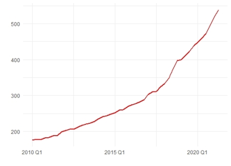
It is seen a very strong uptrend in the data while no seasonality is detected on the graph. Therefore, we will do the first difference to stabilize the mean. But, because of the exponential uptrend, we would better do log-transforming to stabilize the variance, as well.
#The first difference of the log-transformed data
cpi_ts %>%
  gg_tsdisplay(difference(log(value)),
               plot_type='partial') +
  labs(title="", y="")
The data seem to be stationary in terms of the mean. As we analyzed the ACF/PACF plots, we would see that we have seasonal AR(1) and seasonal MA(1) components; because both plots have spikes at seasonal lags(4).
#Modeling the CPI
fit_cpi <- cpi_ts %>%
  model(
    arima010001 = ARIMA(log(value) ~ pdq(0,1,0) + PDQ(0,0,1)),
    arima010100 = ARIMA(log(value) ~ pdq(0,1,0) + PDQ(1,0,0)),
    auto = ARIMA(log(value), stepwise = FALSE)
  )


#Shows all CPI models detailed
fit_cpi %>%
  pivot_longer(everything(),
               names_to = "Model name",
               values_to = "Orders")

# A mable: 3 x 2
# Key:     Model name [3]
#  `Model name`                            Orders
#  <chr>                                  <model>
#1 arima010001  <ARIMA(0,1,0)(0,0,1)[4] w/ drift>
#2 arima010100  <ARIMA(0,1,0)(1,0,0)[4] w/ drift>
#3 auto                  <ARIMA(0,2,1)(1,0,0)[4]>


#Ranks the models by AICc criteria
fit_cpi %>%
  glance() %>%
  arrange(AICc) %>%
  select(.model,AICc)

# A tibble: 3 x 2
#  .model       AICc
#  <chr>       <dbl>
#1 arima010100 -246.
#2 arima010001 -245.
#3 auto        -240.
To the AICc results, the best model has seasonal AR(1) part with the first difference. In the last step for the fitness of the model, we will check for the residuals.
#Checks the residuals
fit_cpi %>%
  select(arima010100) %>%
  gg_tsresiduals(lag=12)

The residuals are within thresholds of the ACF plot, which means no remained information in the data. We can safely forecast with our model.
#Forecasting CPI
fit_cpi %>%
  forecast(h=8) %>%
  filter(.model=="arima010100") %>%
  as.data.frame() %>% #to use the select function below, we convert data to a data frame
  select(index,.mean)

#    index    .mean
#1 2021 Q3 552.9687
#2 2021 Q4 572.1427
#3 2022 Q1 590.3115
#4 2022 Q2 608.4114
#5 2022 Q3 624.0214
#6 2022 Q4 642.0021
#7 2023 Q1 659.8191
#8 2023 Q2 677.8676
Now, we can investigate the convenient time for the election in terms of ruling parties. In order to do that, a graph might be useful. But first of all, we need an decisive variable. The rate of GDP per CPI would be an effective indicator for people’s perception of the country’s situation because it is related to people’s consumer level and the country’s growth rate either.
#Finding the proper time on the plot for the election
tibble(
  ratio=f_gdp$.mean/f_cpi$.mean,
  date=f_gdp$index
) %>%
  ggplot(aes(x=date))+
  geom_line(aes(y=ratio),
            size=1,
            color="green")+
  geom_point(aes(x=date[5],y=ratio[5]),#red point
             color="red",
             size=2)+
  ylab("GDP/CPI")+
  xlab("")+
  theme_minimal()+
  theme(axis.title.y = element_text(margin = margin(r=0.5, unit = "cm")))#moves away from the tick numbers

When we examine the above plot, a significant decrease is observed from the third quarter of this year to the end first quarter of the next year. It is too risky for an election, but after the first quarter of 2022, an increasing trend is seen. But, from the third quarter of 2022, there is again a big decrease until the quarter, in which officially announced election date. The ideal election calendar seems to be the third quarter of 2022 for the ruling parties.
R-bloggers.com offers daily e-mail updates about R news and tutorials about learning R and many other topics. Click here if you're looking to post or find an R/data-science job.
Want to share your content on R-bloggers? click here if you have a blog, or here if you don't.