
How to add a background image to ggplot2 graphs
Want to share your content on R-bloggers? click here if you have a blog, or here if you don't.
When producing so called infographics, it is rather common to use images rather than a mere grid as background. In this blog post, I will show how to use a background image with ggplot2.
Packages required
The following code will install load and / or install the R packages required for this blog post.
if (!require("pacman")) install.packages("pacman")
pacman::p_load(jpeg, png, ggplot2, grid, neuropsychology)
Choosing the data
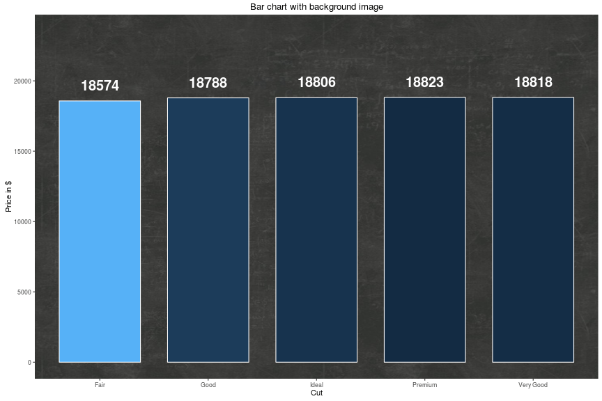
The data set I will be using in this blog post is named diamonds and part of the ggplot2 package. It contains information about – surprise, surprise – diamonds, e.g. price and cut (Fair, Good, Very Good, Premium, Ideal). Using the tapply-function, we create a table returning the maximum prices per cut. Since we need the data to be organized in a data frame, we must transform the table using the data.frame-function.
mydata <- data.frame(price = tapply(diamonds$price, diamonds$cut, max))
mydata$cut <- rownames(mydata)
| cut | price |
|---|---|
| Fair | 18574 |
| Good | 18788 |
| Very Good | 18818 |
| Premium | 18823 |
| Ideal | 18806 |
Importing the background image
The file format of the background image we will be using in this blog post is JPG. Since the image imitates a blackboard, we name it “blackboard.jpg”. The image file must be imported using the readJPEG-function of the jpeg package. The imported image will be saved into an object named image.
imgage <- jpeg::readJPEG("blackboard.jpg")
To import other image file formats, different packages and functions must be used. The next code snippet shows how to import PNG images.
image <- png::readPNG("blackboard.png")
Drawing the plot
In the next step, we actually draw a bar chart with a backgriund image. To make blackboard.jpg the background image, we need to combine the annotation_custom-function of the ggplot2 package and the rasterGrob-function of the grid package.
ggplot(mydata, aes(cut, price, fill = -price)) +
  ggtitle("Bar chart with background image") +
  scale_fill_continuous(guide = FALSE) +
  annotation_custom(rasterGrob(imgage,
                               width = unit(1,"npc"),
                               height = unit(1,"npc")),
                               -Inf, Inf, -Inf, Inf) +
  geom_bar(stat="identity", position = "dodge", width = .75, colour = 'white') +
  scale_y_continuous('Price in $', limits = c(0, max(mydata$price) + max(mydata$price) / 4)) +
  scale_x_discrete('Cut') +
  geom_text(aes(label = round(price), ymax = 0), size = 7, fontface = 2,
            colour = 'white', hjust = 0.5, vjust = -1)
Adding opacity
Using the specification alpha = 0.5, we add 50% opacity to the bars. alpha ranges between 0 and 1, with higher values indicating greater opacity.
ggplot(mydata, aes(cut, price, fill = -price)) +
  theme_neuropsychology() +
  ggtitle("Bar chart with background image") +
  scale_fill_continuous(guide = FALSE) +
  annotation_custom(rasterGrob(imgage,
                               width = unit(1,"npc"),
                               height = unit(1,"npc")),
                               -Inf, Inf, -Inf, Inf) +
  geom_bar(stat="identity", position = "dodge", width = .75, colour = 'white', alpha = 0.5) +
  scale_y_continuous('Price in $', limits = c(0, max(mydata$price) + max(mydata$price) / 4)) +
  scale_x_discrete('Cut') +
  geom_text(aes(label = round(price), ymax = 0), size = 7, fontface = 2,
            colour = 'white', hjust = 0.5, vjust = -1)

The recently published R package neuropsychology contains a theme named theme_neuropsychology(). This theme may be used to get bigger axis titles as well as bigger axis and legend text.
I hope you find this post useful and If you have any question please post a comment below. You are welcome to visit my personal blog Scripts and Statistics for more R tutorials.
Related Post
- Streamline your analyses linking R to SAS: the workfloweR experiment
- R Programming – Pitfalls to avoid (Part 1)
- Eclipse – an alternative to RStudio – part 2
- Eclipse – an alternative to RStudio – part 1
- How to use R for matching samples (propensity score)
R-bloggers.com offers daily e-mail updates about R news and tutorials about learning R and many other topics. Click here if you're looking to post or find an R/data-science job.
Want to share your content on R-bloggers? click here if you have a blog, or here if you don't.