
ggplot2: Quick Heatmap Plotting
Want to share your content on R-bloggers? click here if you have a blog, or here if you don't.
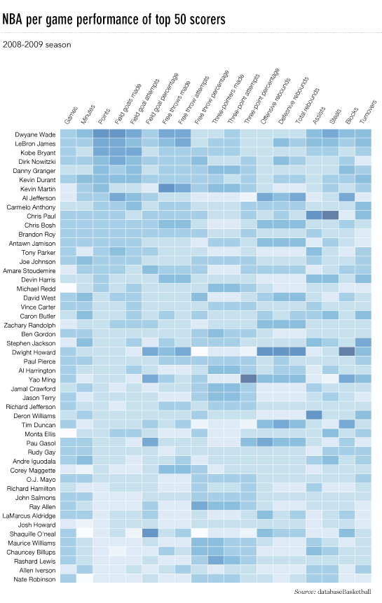
A post on FlowingData blog demonstrated how to quickly make a heatmap below using R base graphics.
This post shows how to achieve a very similar result using ggplot2.
Data Import
FlowingData used last season’s NBA basketball statistics provided by databasebasketball.com, and the csv-file with the data can be downloaded directly from its website.
> nba <- read.csv("http://datasets.flowingdata.com/ppg2008.csv")
|
The players are ordered by points scored, and the Name variable converted to a factor that ensures proper sorting of the plot.
> nba$Name <- with(nba, reorder(Name, PTS)) |
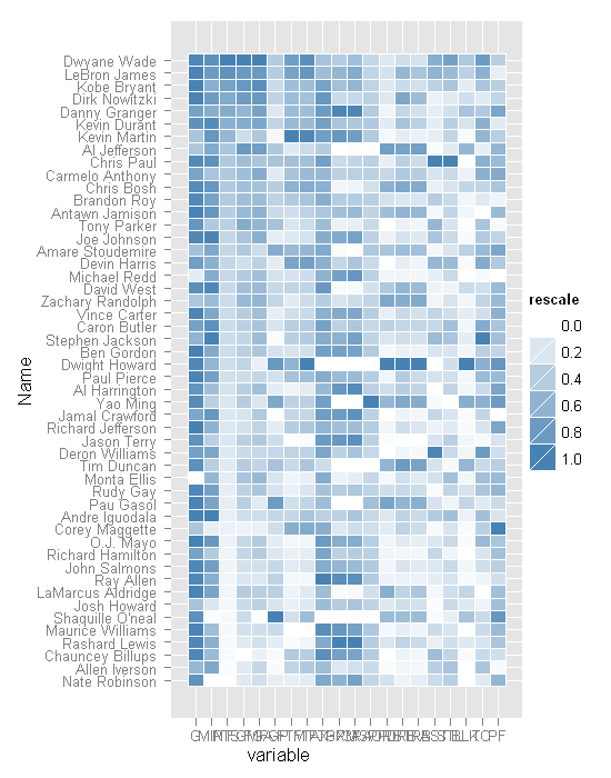
Whilst FlowingData uses heatmap function in the stats-package that requires the plotted values to be in matrix format, ggplot2 operates with dataframes. For ease of processing, the dataframe is converted from wide format to a long format.
The game statistics have very different ranges, so to make them comparable all the individual statistics are rescaled.
> library(ggplot2) |
> nba.m <- melt(nba) > nba.m <- ddply(nba.m, .(variable), transform, + rescale = rescale(value)) |
Plotting
There is no specific heatmap plotting function in ggplot2, but combining geom_tile with a smooth gradient fill does the job very well.
> (p <- ggplot(nba.m, aes(variable, Name)) + geom_tile(aes(fill = rescale), + colour = "white") + scale_fill_gradient(low = "white", + high = "steelblue")) |
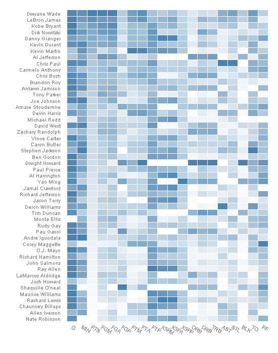
A few finishing touches to the formatting, and the heatmap plot is ready for presentation.
> base_size <- 9 > p + theme_grey(base_size = base_size) + labs(x = "", + y = "") + scale_x_discrete(expand = c(0, 0)) + + scale_y_discrete(expand = c(0, 0)) + opts(legend.position = "none", + axis.ticks = theme_blank(), axis.text.x = theme_text(size = base_size * + 0.8, angle = 330, hjust = 0, colour = "grey50")) |
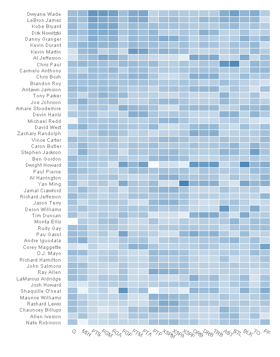
Rescaling Update
In preparing the data for the above plot all the variables were rescaled so that they were between 0 and 1.
Jim rightly pointed out in the comments (and I did not initally get it) that the heatmap-function uses a different scaling method and therefore the plots are not identical. Below is an updated version of the heatmap which looks much more similar to the original.
> nba.s <- ddply(nba.m, .(variable), transform, + rescale = scale(value)) |
> last_plot() %+% nba.s |

R-bloggers.com offers daily e-mail updates about R news and tutorials about learning R and many other topics. Click here if you're looking to post or find an R/data-science job.
Want to share your content on R-bloggers? click here if you have a blog, or here if you don't.