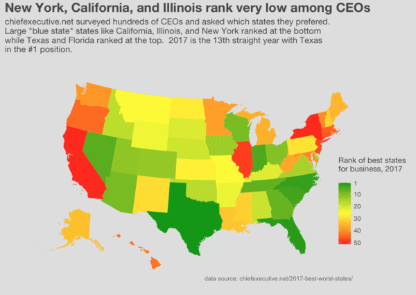
Mapping the best states for business
Data science gives you tools to find opportunities A few months ago, I wrote a blog post about Amazon’s search for a location for a second headquarters. For those of you who don’t know about it, the technology giant – which currently has its headquarters in Seattle Washington – announced ... [Read more...]