
A nifty line plot to visualize multivariate time series
Want to share your content on R-bloggers? click here if you have a blog, or here if you don't.
A few days ago a colleague came to me for advice on the interpretation of some data. The dataset was large and included measurements for twenty-six species at several site-year-plot combinations. A substantial amount of effort had clearly been made to ensure every species at every site over several years was documented. I don’t pretend to hide my excitement of handling large, messy datasets, so I offered to lend a hand. We briefly discussed a few options and came to the conclusion that simple was better, at least in an exploratory sense. The challenge was to develop a plot that was informative, but also maintained the integrity of the data. Specifically, we weren’t interested in condensing information using synthetic axes created from a multivariate soup. We wanted some way to quickly identify trends over time for multiple species.
I was directed towards the excellent work by the folks at Gallup and Healthways to create a human ‘well-being index’ or WBI. This index is a composite of six different sub-indices (e.g., physical health, work environment, etc.) that provides a detailed and real-time view of American health. The annual report provides many examples of elegant and informative graphs, which we used as motivation for our current problem. In particular, page 6 of the report has a figure on the right-hand side that shows the changes in state WBI rankings from 2011 to 2012. States are ranked by well-being in descending order with lines connecting states between the two years. One could obtain the same conclusions by examining a table but the figure provides a visually pleasing and entertaining way of evaluating several pieces of information.
I’ll start by explaining the format of the data we’re using. After preparation of the raw data with plyr and reshape2 by my colleague, a dataset was created with multiple rows for each time step and multiple columns for species, indexed by site. After splitting the data frame by site (using split), the data contained only the year and species data. The rows contained species frequency occurrence values for each time step. Here’s an example for one site (using random data):
| step | sp1 | sp2 | sp3 | sp4 |
|---|---|---|---|---|
| 2003 | 1.3 | 2.6 | 7.7 | 3.9 |
| 2004 | 3.9 | 4.2 | 2.5 | 1.6 |
| 2005 | 0.4 | 2.6 | 3.3 | 11.0 |
| 2006 | 6.9 | 10.9 | 10.5 | 8.4 |
The actual data contained a few dozen species, not to mention multiple tables for each site. Sites were also designated as treatment or control. Visual examination of each table to identify trends related to treatment was not an option given the abundance of the data for each year and site.
We’ll start by creating a synthetic dataset that we’ll want to visualize. We’ll pretend that the data are for one site, since the plot function described below handles sites individually.
#create random data
set.seed(5)

#time steps
step<-as.character(seq(2007,2012))

#species names
sp<-paste0('sp',seq(1,25))

#random data for species frequency occurrence
sp.dat<-runif(length(step)*length(sp),0,15)

#create data frame for use with plot
sp.dat<-matrix(sp.dat,nrow=length(step),ncol=length(sp))
sp.dat<-data.frame(step,sp.dat)
names(sp.dat)<-c('step',sp)
The resulting data frame contains six years of data (by row) with randomized data on frequency occurrence for 25 species (every column except the first). In order to make the plot interesting, we can induce a correlation of some of our variables with the time steps. Otherwise, we’ll be looking at random data which wouldn’t show the full potential of the plots. Let’s randomly pick four of the variables and replace their values. Two variables will decrease with time and two will increase.
#reassign values of four variables

#pick random species names
vars<-sp[sp %in% sample(sp,4)]

#function for getting value at each time step
time.fun<-function(strt.val,steps,mean.val,lim.val){
	step<-1
	x.out<-strt.val
	while(step<steps){
		x.new<-x.out[step] + rnorm(1,mean=mean.val)
		x.out<-c(x.out,x.new)
		step<-step+1
		}
	if(lim.val<=0) return(pmax(lim.val,x.out))
	else return(pmin(lim.val,x.out))
	}

#use function to reassign variable values
sp.dat[,vars[1]]<-time.fun(14.5,6,-3,0) #start at 14.5, decrease rapidly
sp.dat[,vars[2]]<-time.fun(13.5,6,-1,0) #start at 13.5, decrease less rapidly
sp.dat[,vars[3]]<-time.fun(0.5,6,3,15) #start at 0.5, increase rapidly
sp.dat[,vars[4]]<-time.fun(1.5,6,1,15) #start at 1.5, increase less rapidly
The code uses the sample function to pick the species in the data frame. Next, I’ve written a function that simulates random variables that either decrease or increase for a given number of time steps. The arguments for the function are strt.val for the initial starting value at the first time step, steps are the total number of time steps to return, mean.val determines whether the values increase or decrease with the time steps, and lim.val is an upper or lower limit for the values. Basically, the function returns values at each time step that increase or decrease by a random value drawn from a normal distribution with mean as mean.val. Obviously we could enter the data by hand, but this way is more fun. Here’s what the data look like.

Now we can use the plot to visualize changes in species frequency occurrence for the different time steps. We start by importing the function, named plot.qual, into our workspace.
require(devtools)
source_gist('5281518')
par(mar=numeric(4),family='serif')
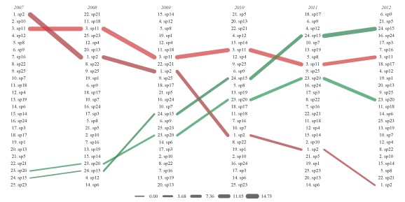
plot.qual(sp.dat,rs.ln=c(3,15))

The figure shows species frequency occurrence from 2007 to 2012. Species are ranked in order of decreasing frequency occurrence for each year, with year labels above each column. The lines connect the species between the years. Line color is assigned based on the ranked frequency occurrence values for species in the first time step to allow better identification of a species across time. Line width is also in proportion to the starting frequency occurrence value for each species at each time step. The legend on the bottom indicates the frequency occurrence values for different line widths.
We can see how the line colors and widths help us follow species trends. For example, we randomly chose species two to decrease with time. In 2007, we see that species two is ranked as the highest frequency occurrence among all species. We see a steady decline for each time step if we follow the species through the years. Finally, species two was ranked the lowest in 2012. The line widths also decrease for species two at each time step, illustrating the continuous decrease in frequency occurrence. Similarly, we randomly chose species 15 to increase with each time step. We see that it’s second to lowest in 2007 and then increases to third highest by 2012.
We can use the sp.names argument to isolate species of interest. We can clearly see the changes we’ve defined for our four random species.
plot.qual(sp.dat,sp.names=vars)
In addition to requiring the RColorBrewer and scales packages, the plot.qual function has several arguments that affect plotting:
x |
data frame or matrix with input data, first column is time step |
x.locs |
minimum and maximum x coordinates for plotting region, from 0–1 |
y.locs |
minimum and maximum y coordinates for plotting region, from 0–1 |
steps |
character string of time steps to include in plot, default all |
sp.names |
character string of species connections to display, default all |
dt.tx |
logical value indicating if time steps are indicated in the plot |
rsc |
logical value indicating if line widths are scaled proportionally to their value |
ln.st |
numeric value for distance of lines from text labels, distance is determined automatically if not provided |
rs.ln |
two-element numeric vector for rescaling line widths, defaults to one value if one element is supplied, default 3 to 15 |
ln.cl |
character string indicating color of lines, can use multiple colors or input to brewer.pal, default ‘RdYlGn’ |
alpha.val |
numeric value (0–1) indicating transparency of connections, default 0.7 |
leg |
logical value for plotting legend, default T, values are for the original data frame, no change for species or step subsets |
... |
additional arguments to plot |
I’ve attempted to include some functionality in the arguments, such as the ability to include date names and a legend, control over line widths, line color and transparency, and which species or years are shown. A useful aspect of the line coloring is the ability to incorporate colors from RColorBrewer or multiple colors as input to colorRampPalette. The following plots show some of these features.
par(mar=c(0,0,1,0),family='serif')
plot.qual(sp.dat,rs.ln=6,ln.cl='black',alpha=0.5,dt.tx=F,
	main='No color, no legend, no line rescaling')
#legend is removed if no line rescaling

par(mfrow=c(1,2),mar=c(0,0,1,0),family='serif')
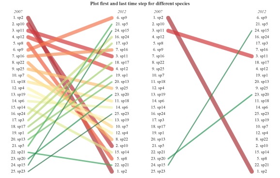
plot.qual(sp.dat,steps=c('2007','2012'),x.locs=c(0.1,0.9),leg=F)
plot.qual(sp.dat,steps=c('2007','2012'),sp.names=vars,x.locs=c(0.1,0.9),leg=F)
title('Plot first and last time step for different species',outer=T,line=-1)
par(mar=c(0,0,1,0),family='serif')
plot.qual(sp.dat,y.locs=c(0.05,1),ln.cl=c('lightblue','purple','green'),
	main='Custom color ramp')

These plots are actually nothing more than glorified line plots, but I do hope the functionality and display helps better visualize trends over time. However, an important distinction is that the plots show ranked data rather than numerical changes in frequency occurrence as in a line plot. For example, species twenty shows a decrease in rank from 2011 to 2012 (see the second plot) yet the actual data in the table shows a continuous increase across all time steps. This does not represent an error in the plot, rather it shows a discrepancy between viewing data qualitatively or quantitatively. In other words, always be aware of what a figure actually shows you.
Please let me know if any bugs are encountered or if there are any additional features that could improve the function. Feel free to grab the code here.

R-bloggers.com offers daily e-mail updates about R news and tutorials about learning R and many other topics. Click here if you're looking to post or find an R/data-science job.
Want to share your content on R-bloggers? click here if you have a blog, or here if you don't.